Interior. Trends | Dom & Podium, August 2018
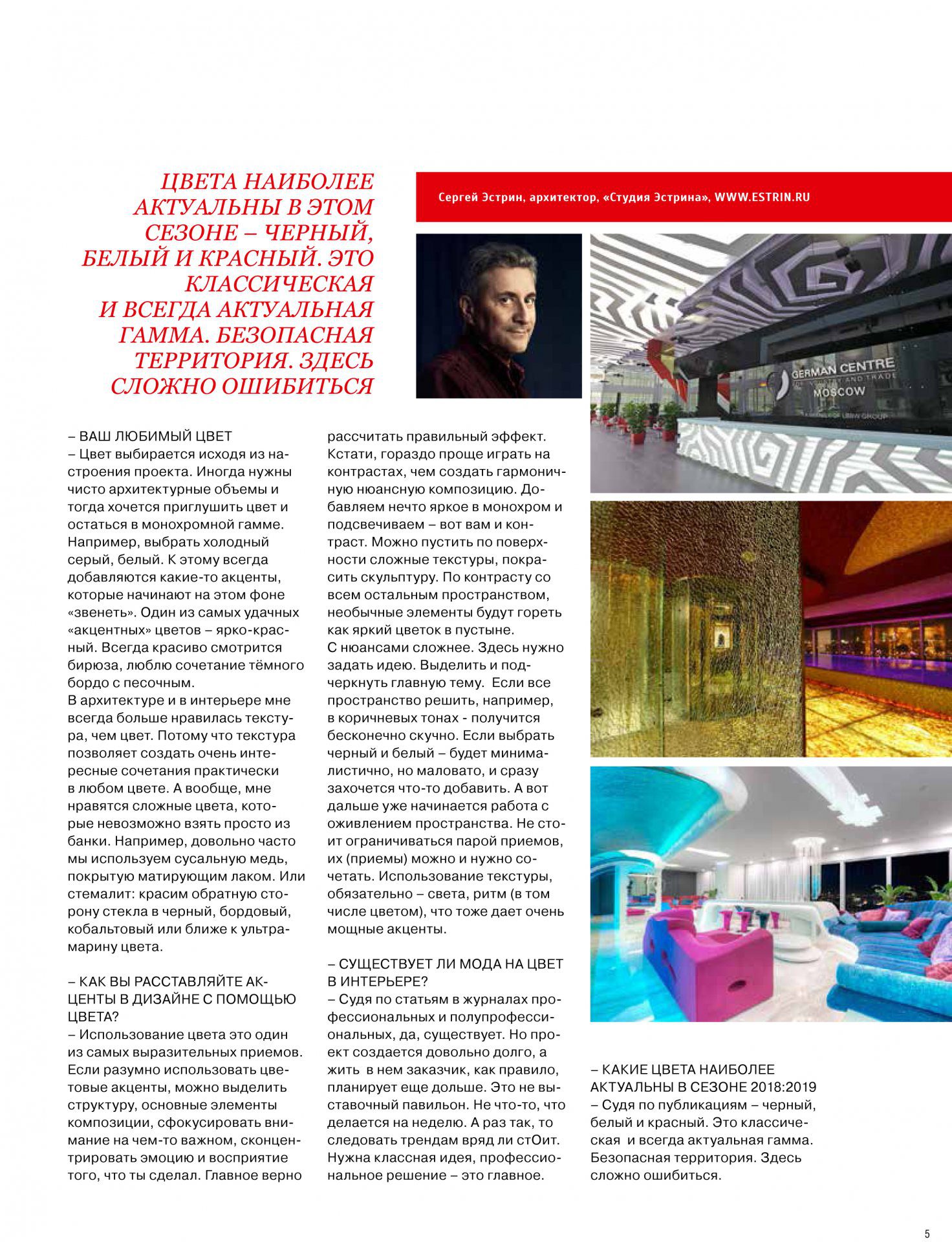
Your favorite color
The color is chosen based on the mood of the project. Sometimes you need purely architectural volumes and then you want to muffle the color and stay in the monochrome. For example, choose cold gray, white. To this, there are always added some accents that “rings” against this background. One of the most successful “accent” colors is bright red. Turquoise always looks beautiful, I love the combination of dark burgundy with sand.
In architecture and in the interior I always liked the texture more than the color. Because the texture allows creating very interesting combinations in almost any color. In general, I like complex colors that can not be taken simply from a can. For example, quite often we use copper foil covered with matting varnish. Or stemalit: paint the reverse side of the glass in black, burgundy, cobalt or closer to the ultramarine color.
How do you arrange the accents in the design with the help of color?
Using color is one of the most expressive techniques. If it’s reasonable to use color accents, you can select the structure, the main elements of the composition, focus on something important, concentrate the emotion and perception of what you did. it’s easier to play on contrasts than to create a harmonious nuance composition. Add something bright in monochrome and highlight – that’s the contrast for you. You can put complex textures on the surface, paint the sculpture. In contrast to all the rest of the space, unusual elements will burn like a bright flower in the desert.
With nuances it is more difficult. Here it is necessary to set an idea. To highlight and emphasize the main theme. If the entire space is solved, for example, in brown tones – it will endlessly boring. If you choose black and white – it will be minimal, but not enough, and immediately you want to add something. But then work begins with the revitalization of space. Do not be limited to a couple of receptions, their (receptions) can and should be combined. Use of texture, necessarily-light, rhythm (including color), which also gives very powerful accents.
Is there a fashion for color in the interior?
Judging by the articles in the magazines professional and semi-professional, yes, there is. But the project is being created for quite a long time. This is not an exhibition pavilion. Not something that is done for a week. And if so, then it’s hardly worth following the trends. Need a cool idea, a professional solution – this is important.
What colors are most relevant in the 2018 season: 2019
Judging by the publications – black, white and red. This is a classic and always up-to-date gamma. Safe territory. It’s hard to make a mistake here.
Dom & Podium