Sanofi-Aventis Company’s Office in Moscow | archi.ru, 22.12.2011
The location for the new office – in the business center that was built where “Minsk” hotel had been located – was chosen by Sanofi-Aventis in the first place because of the convenience of being close to the city center, at one of its main streets. This “geographic” advantage, however, had its weak sides as well: for one, the building on Tverskaya street has rigorous height restrictions – which inevitably led to the construction of floors with relatively low ceilings.
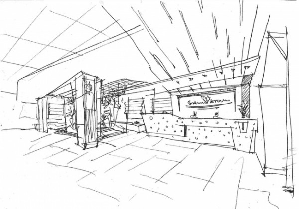
At the very first acquaintance with the leased premises Sergey Estrin and his team realized that the main problem that they would have to find a solution for was the feeling of “crushing” overhanging ceilings. The original layout of the floors could hardly be called successful or rational either – in the center they were “cut through” with a rectangular atrium, the area of which, however, was disproportionately smaller than the area of the floors itself so it actually got “lost” in the overall volume. “The first sketches did not look very promising: the tiny atrium, “thick” rooms along its perimeter, a plague of communication lines that could not be moved anywhere – Sergey Estrin reminisces – I tried to spin this plan in every way I could think of until I finally came up with the solution that consisted in breaking through the floors with a few pass-through’s that would not be necessarily parallel to one another”.
There are four such “axis” corridors, and only two of them intersect at a right angle thus following the rigid geometry of the atrium, while the other two go completely different ways. Their width also varies – at some places they are narrower, at some places they are wider, and at some places they are intercepted by open-ended conference rooms. This solution gave the architects an opportunity to get rid of the visual monotony that is so characteristic of office corridors.It is also worth mentioning that none of the resulting galleries ends in a dead end: they open into a room that commands either the atrium view or the green house.
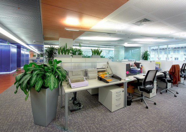
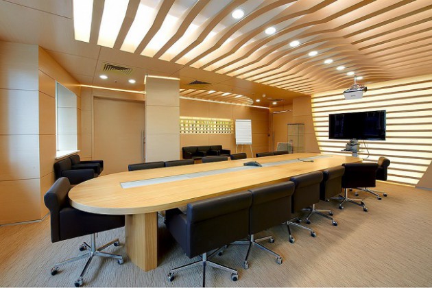
This solution fills the rather narrow passes with extra light and “air”, and, most importantly, allows creating very different standpoints, thus making the corridors look very different as well. The architects also tried to at least partially offset the moderate height of the floors at the expense of really low false floors and thin ceiling plating (for this purpose, perforated plasterboard was used) but most of the work on “withholding” the ceiling at the appropriate level, was, of course, done by the new lamps.
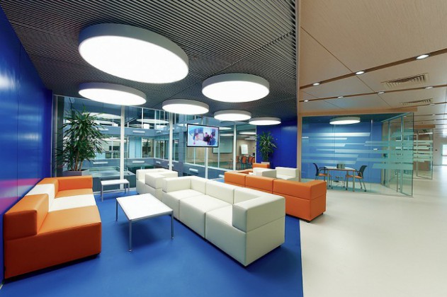
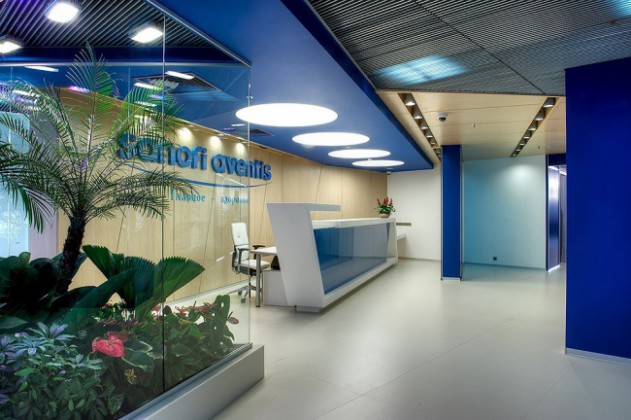
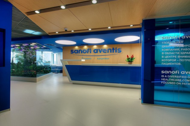
In some corridors, the architects used elongated lamps, the length of which was comparable to the length of the very galleries (these would give floodlight), while in the others, by contrast, multidirectional tiny lights were used that were installed into the decorative cracks (these would break the space into separate segments). Special fluorescent lamps were used in the green house areas, while for the meeting rooms, conference halls, reception desks, and coffee points the architects chose to use large round dome lights that cause unmistakable associations with medical pills – the signature product of Sanofi-Aventis.
Text: Anna Martovitskaya