Anna Martovitskaya. Tobacco office | archi.ru, 13.09.2013
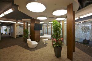
Sergey Estrin Architectural Studio has recently completed interior design for Philip Morris International Head Quarters.
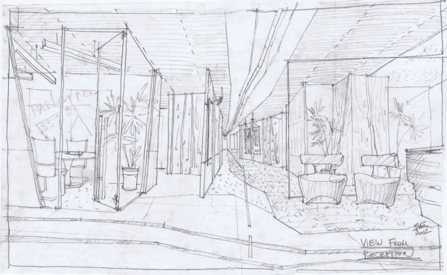
Philip Morris’s new office is situated in Legent of Tsvetnoy Business Centre. The client wished to transform 9,000 sqm space into comfortable working environment, with minimal resemblance to standard office arrangement of long corridors trapped between long chains of doors. Implementation of this idea was immediately offered to Sergey Estrin, whose completed projects become the most solid grounds for the choice. Mr. Estrin has indeed created a space flooded with intricate space plots.
The work on tobacco company design appeared to become an unconventional challenge for the architect; above all in terms of design philosophy. Typically the basis of a Head Quarters image becomes corporation’s activities or products. With cigarettes it’s somewhat ambiguous; use of cigarettes representation as decoration element could be taken as smoking promotion. On the other hand, Mr. Estrin didn’t want to ignore the matter completely. Therefore his team was looking for hints that would giveaway details of Philip Morris operation.
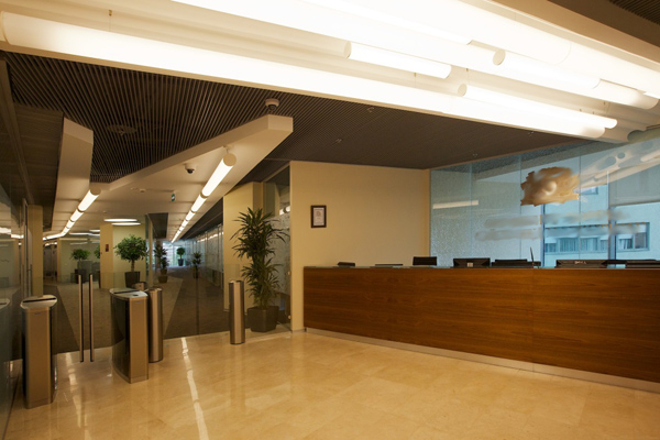
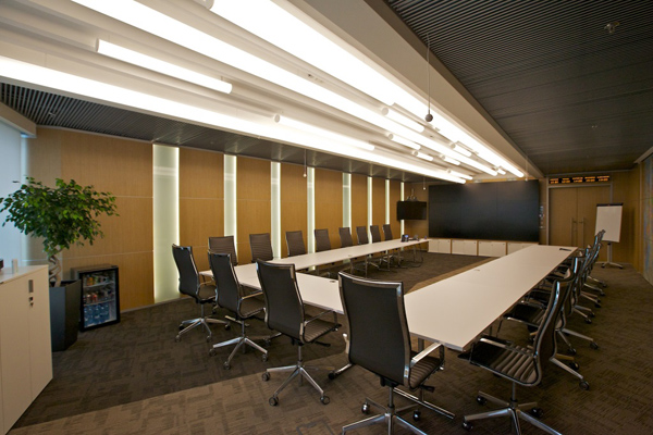
The light fixtures in the entry zone, main corridors and meeting rooms are probably the most conspicuous for that matter. They are made of white frosted glass and do not only have distinctive oblong cylinder shape, but also side cups of darker colour, resembling compressed tobacco.
The office fit out colour range also reminds us of company product – tobacco. The mixture of pale and deep brown shades in decoration reminded of various blends.
“One of inspiration sources for us was, of course, the legendary Marlboro Cowboy, yet we have only left slightest hint on this rough style.”, – sais Sergey Estrin.
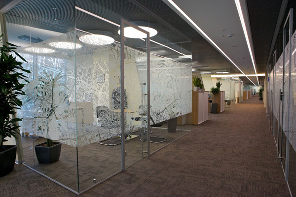
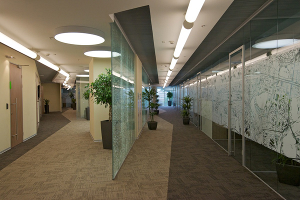
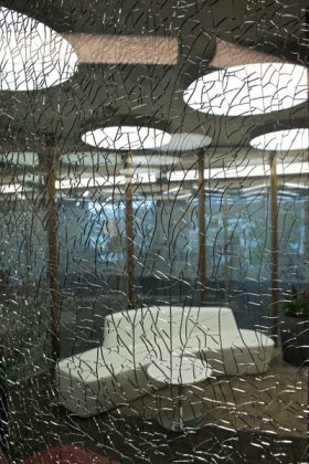
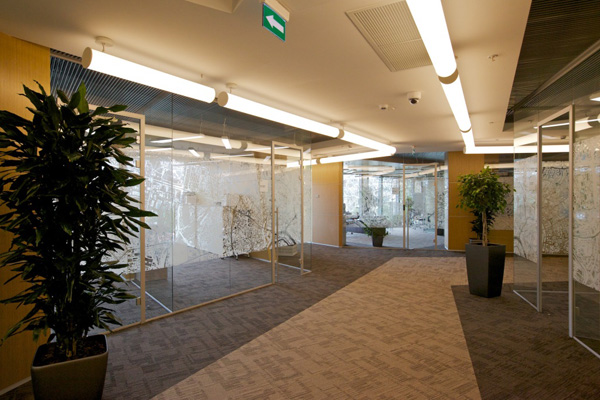
To create efficient open space the architect used transparent partitions installed under various angles, thus breaking corridor perspective. To make them more tangible the authors have applied frosted drawings; also some of the transparent partitions were made with broken glass effect forcing refracted light to play around with innumerable fissures. Floor cover is created from polygonal covering of various shades. It therefore give the impression that some space is split by a lightning; some floor is made of drifting ice floe disrupted into thousand fragments.
“In this space we tend to combine areas originated motion and fast decision making with areas that seem to be decelerating reality and disposing to making a pause, – sais Sergey Estrin. – It seems to me that this is exactly the main purpose of smoking: during the day to have plausible excuse for a break. Although I have not been smoking for years, in the image of Philip Morris HQ I wanted to convey this attitude of mind – work and lifestyle with a room for a break.”
Team: Leader — S. Estrin, Chief Architect — Sheremetieva Y.
Russian text by Anna Martovitskaya, specially for АРХИ.ру
