Grigory Revzikn. Bronnaya fortress | Лехаим, 2008, №3.
There aren’t that many canonical requirements for Synagogues – mizrakh towards East, where Jerusalem is, bima (not obligatory), gallery or other premises for women. Yet it does not mean that architecture of a Synagogue doesn’t speak for itself.
This actually makes a Synagogue quite a challenge for an architect. One can pretend to little, yet if pretends to more there is not a canon to cling to. Synagogue is no temple, it’s a community life center, and it is each time to be decided what is should look like.
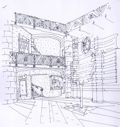
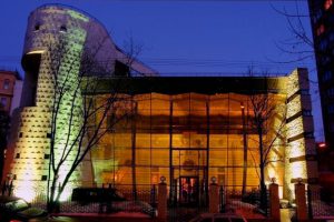
The main remarkable feature of the Synagogue on Bronnaya is the tower with large window and Chanukah menorah. The eastern wall of prayer hall is made of large rustic stone as if a fragment of ancient structure. It is the most powerful feature in the interior; the columns encasing the eastern wall look like much later addition.
The Synagogue has been built in 1883, was returned to Jewish community in 1990, Sergey Estrin’s design appeared in 2003.
I believe, initially it wasn’t such a great building with parochial facade tenting to resemble Jewish themes of Alhambra. Later the facade has been replaced. But when restored it became a relic. This facade was seen by those coming to pray, those executed, those walked buy when the Synagogue was closed and turned into club. And now it’s back.
The new architecture highlights the regained treasure and the glass facade shelters it much like showcase in museum shields a precious relic. If we were to talk about meaning involved – it is first of all the memory. Memory of what happened with Jews in USSR in 20th century and what happened to Jews in 20th century in general.
You see what happened here. Canonically there are barely any requirements for a Synagogue. But with this building, this place there is a memory, and this memory has become the main thesis for the architecture. I do not know any other Synagogue with program of this kind, with this kind of meaning – it came out of the very building, of this Moscow history. And this is not just well thought. It’s thought right.
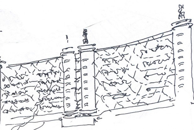
But the architecture is not limited by this. Reliquary is just half of the meaning. The other half is the fortress. The tower is facing the city, and the tower is well made. It’s tiled with slightly shifted stone for when lit from underneath the shadows weave the most complicated pattern as if it is remains of ancient fortress, built from heavy stones. The same fortress like, defensive appearance have the lateral face with narrow slit-like windows. In fact at certain moment if one does not enter the Synagogue it could seam that this is a medieval fort adapted for modern needs.
But here is a paradox. Outside it is a fortress with solid walls, stones and narrow side windows. Inside – memory of that destroyed and those killed.
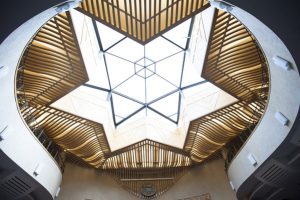
Yet, it is not a grim space. Quite the opposite. Daniel Libeskind Jewish Museum in Berlin has created a design where walls were trimmed with cuts. The space is most tragic. Sergey has similar cuts along corridor ceilings. Yet with Libeskind there is darkness. And here there are lamps, plenty of light. Maybe this is it, maybe not. Here I am talking about those intangible qualities of architecture that are elusive and vague. This is Hasid Synagogue; it is such a warm space. Not as much triumphal as everyday joyful. When looking through narrow slit-like windows into surrounding city, there is no feeling of being in besieged fortress awaiting for assault. It feels like shivery Moscow day while you are at home where there is light. I do not quite understand how it is possible to combine this idea of reliquary with fortress image, but it clearly is. To be honest, I am rather glad that I do not understand it. There should be something not entirely perceivable about good architecture. Some things are there just to feel deeply.
