Tatiana Shovskaya. Information flows | archi.ru, 23.08.2012
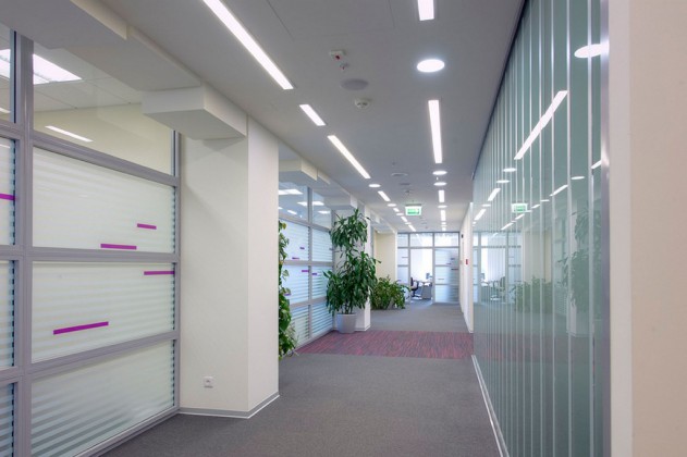
Since Fitch Ratings specialises in analytics, estimates, and ratings, i.e. handling enormous amounts of information, the solution proposed by the architect reflects the process of data transfer. One of the main advantages of this idea, according to Sergey Estrin, consists in the fact that it yields a lot of opportunities of depicting the data transfer as such: this can be anything from a news ticker to a teletype tape to even the Morse code. Where it was necessary to make the decorative elements as scarce as possible, this solution gave the architect an opportunity to decorate the interior with literally one or two unobtrusive strokes that at the same time accurately reflected the essence of the company’s activity. A drawing of narrow stripes adorns the glass partitions and doors, and an analogous solution is applied to the ceiling light, as well as to the decorative design of the immobile beams, girders, and utility lines casings and ducts.
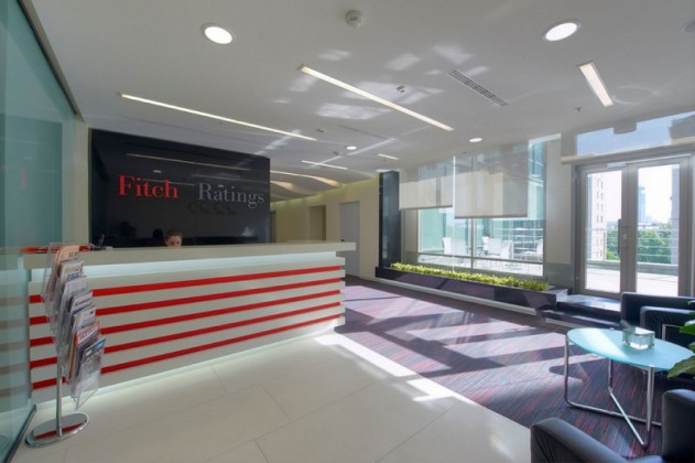
Yet another means of creating a dramatic interior was its colour solution. It should be noted, however, that the architects based themselves on Fitch Ratings corporate colours – black, gray, and red- only to a certain extent. As Sergey Estrin shares, this triad seemed to him to be too much on the contrast side and eventually gray was chosen as the dominant colour – in the interior it is represented in its numerous shades and enriched by a softened purple shade of red. The latter shows through in details only, literally in one or two strokes but at the same time it becomes a very critical accent in the balanced palette of this interior.
The reception area is marked off with white ceramic granite, while the reception desk is “pierced” with red horizontal lines, thanks to which this element perfectly matches the agency’s logo placed on a black background, without blending with it. The bright colours and the position of the desk to the left from the main entrance make it the first thing that meets the newcomer’s eye in this brightly lit room. The transparent wall that separates the employees-only part of the office from the terrace is accentuated with decorative green planting that brings the summer atmosphere into the office even in the coldest of winter. After that, the visitor steps further inside, to the meeting rooms, from where one can see the working area of the office through the glass partitions.
The walls of the meeting rooms are also executed in glass, decorated with a pattern of opaque stripes, which helps to singularize their inner space. These premises can also be converted into one – for the organization of press conferences, for example – while behind the meeting rooms, there is the open space area where the analysts work. The architects deliberately went as far as to make the workspace partially visible from the very entrance point and make it even more visible and transparent as the visitor steps inside the office so as to highlight the atmosphere of strenuous work that Fitch Ratings is known for.
Complete text in Russian by: Tatiana Shovskaya for archi.ru


