Marina Gloushatova. Creative approach | officenext.ru, 18.03.2011
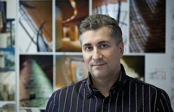
Sergey Estrin has shared with us his thoughts about recent tendencies in new corporate interior creation.
What novelty approach in office space arrangements do you use and think of as promising?
Most of the offices today have open space layout. In order to make the space alive we create “space pulsation” – alteration of high density areas with empty open zones. If we were to simply spread working area of open space it will turn into waiting launch.
For example, in an office of a local IT company, the vast majority of employees were located in standard blocks. We have managed to convince the management of necessity of so to say breaking points, separating large blocks into visually independent areas. In order to avoid monotony we have delimited open space with glass and gypsum board partitions (shaping meander in footprint), painted them in different colours, thus reviving the space. Using various colours, textures and lights we have managed to create in the office comfortable contented environment.
Sergey has mentioned space planning in France. In two-storey office all workplaces are tightly located along perimeter with exits to large premises with two tiers of windows – centre of informal communications, cafe, meeting point, etc.
These days architects are talking about diluting boundaries – domesticating office interior, combining it with relaxation zones. What is the future of this tendency?
I do not see the need in play zones inside an office. At the beginning of a project one receives an assignment – a list of departments and employees to accommodate competently. However, the entire exclusion of free space would have also been inappropriate.
Sergey has mentioned “domesticated” office of Mr. Zadelhoff – co-owner of DTZ, whose office in Amsterdam is situated in beautiful mention with views on canal, without tables but with the most comfortable sofas.
Still in Russia the best solution would be not to mix “domestic” zones with business ones, but accommodate some casual furniture in recreation zones to create contrast with the main space.
Budget is still an issue; as much as desire to promote brand via interior design. What are the means to make artistic space at minimal expense?
In this case the best scenario would be to take advantage of colour, graphic elements, signs, and large decor elements. For example, one of the lowest budget projects we had was IBS. In order to decorate large stained glass surfaces in four atriums with coffee points we used film with colour print with large dot pattern. Each office block facing the atrium has its colour – emerald, violet, orange. The drawing on stained glass adds some shade to this..
Should we leave the money aside, what are the ways of creating interesting environment?
One of the most significant parts of the office interior, yet, often the most costly, is lightning. I would have made the engineering part merely sufficient and spend the rest of the money on light. I wouldn’t even worry about fit out materials or furniture, as a lot can be achieved just with the suitable light.
For example in The Vision Care Institute light fixtures – in the shape of eyelashes are made of plexiglass. It looks as if the lashes shine by themselves. We also applied fine mesh on columns with inner light turning them into light fixtures setting pace of interior.
Talking about new materials Sergey mentioned a private project, a penthouse where about five kilometers of velvety strips were stitched together in a particular way to create a fabric sculpture, lit from underneath.
In another project we have completed distinctive decorative cover, lit from inside, thus creating whole, unbroken structure of a corridor with intricate lugs.
Often an unconventional solution is found while solving a problem. Ones we needed a large flat light fixture that would not take much of the height. We fixed under the ceiling a plane with gold leaf sheets, attached by the central part only, leaving the edges free. Motion of air moves the leafs and the room becomes alive.
It is crucial for an architect to supervise a project till its final stage, because only then come out what was meant. Typical client’s delusion is his confidence in fact that the client himself understands everything in design and architecture. When an architect is not allowed to make the final touch in project completion (for example when a client decides to chose himself furniture, curtains or pictures) – it is always obvious and the most important – the result is very average.
How do you see an office in the future?
Sergey told us about his interesting experience in America with office parks and work in skyscraper, mentioning that the most rational space arrangement he has seen was inside an mobile home, where tiny trailer has sitting room, kitchen, canteen, three bedroom and a bathroom.
Ruusian text by Marina Gloushatova, for office next

