Anna Martovitskaya. Drops of liquor | archi.ru, 10.07.2013
For the company “Diageo”, “Sergey Estrin Architectural Studio” has designed a new office where the interior promotes the top brands of this world’s largest producer of alcoholic beverages.
Diageo is the true elite liquor empire. Eight of the world’s twenty best-selling brands, including Johnnie Walker, White Horse and Crown Royal whiskey, Smirnoff vodka, Baileys liqueur, Captain Morgan rum, Gordon’s gin, and Guinness beer, are produced by this particular company. Making plans on establishing a new representative office in Moscow and renting for this purpose the entire floor in one of Moscow City’s skyscrapers, Diageo employed “Sergey Estrin Architectural Studio” with the mission to create design that would highlight the vast diversity of the company’s product.
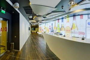
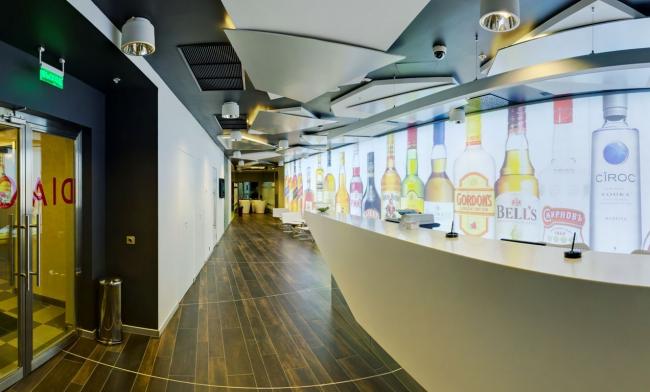
The solution for entrance lobby design was staring one in the face: the background of the reception desk is a backlit wall that bears photo-printed images of Diageo most famous beverages. The liquor theme is also supported by the ceiling design: numerous lights are concealed behind the snow-white gypsum boards shaped somewhat like ice cubes.
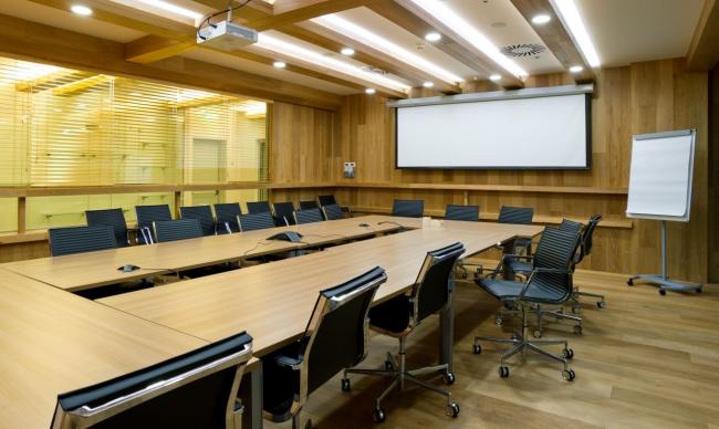
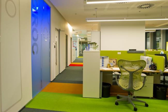
“One could say Client’s specification boils down to one word – “identity” – Sergey Estrin reminisces – We had the job to emphasize the identity of each brand in the interior we create”. Luckily, the very structure of the new office lent itself to this – each of the brands, two brands maximum, was to get a dedicated meeting room. The square footage of these rooms varied considerably depending on the importance and popularity of this or that beverage but their total number was so large (over 20) that the architect almost at once proposed to group them along the outer perimeter of the rented floor. Thus, the office got a “street” of elite alcohol of sorts – a street that belts the main office open space. Approving the layout that the architect proposed, the Client made his requirements to the interior a little more specific: the most exciting design features are to be concentrated in creating the right image of the company brands, while the working places were to be designed to meet ultimate functionality and efficiency.
Hence the “street” design laconism– from outside the meeting rooms look just about the same. Each of them is accessed via a frosted glass door decorated with a stylized image of a bottle. The only thing that makes them different from one another is the colour and the name of the brand itself that is also doubled on plates hung along the corridor to help the visitors to quicker find their way around in the “drinks on offer”. The meeting room entrances are also highlighted with another flooring colour – generally, in the open space the carpet of noble dark gray colour is used, and from under the doors shoot the carpet strips of bright colours, as if the drinks somehow had found a way to seep outside. These bright colourful accents spread further over the office – the architects use similar colours to decorate the partitions between the employees’ desks, adding to open space reserved atmosphere a tangible drop of easiness and positive energy.
As for the design of the meeting rooms, Sergey Estrin mentions with regret that not all originally approved architect’s ideas were implemented. The architects developed most thoroughly the image of each brand, but, as it often happens, limited budget and severe time limits introduced their adjustments. Still, the architects were able to keep the main idea – the office of Diageo creates a whole galaxy of bright rooms of various premises that visualize the diversity of the company’s product.
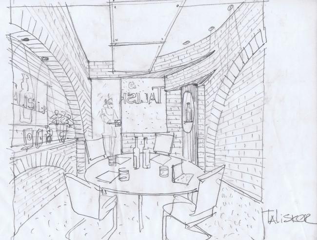
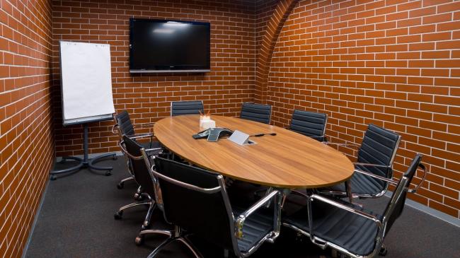
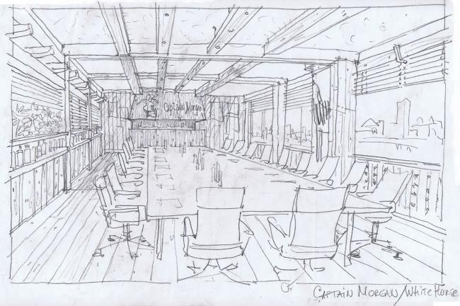
For example, for the “representative office” of the famous single malt Scotch whiskey Talisker, the architects designed a room that imitates a small malt distillery built from brick. The design in original sketches, according to Sergey Estrin, was more brutal: it was supposed that real bricks would be used (instead of tiles), with not decorative but real, rather functional niches. Just as brutal the room of Captain Morgan and White Horse was going to be. The aesthetics of rum suggested an idea to complete interior fit-out with fumed oak, decorating the bare beams with metallic rivets. In reality, the messroom of the pirate ship does not look so “notorious” – light tint and polished laminate surface create a more intimate effect, even ostentatiously fine appearance.
The architects, however, were able to almost entirely implement their design idea in Diageo’s largest meeting room – some sort of an “integrated staff” of all the sorts of whiskey on offer. The walls of this room are decorated with black bold stucco that has the texture of nipped hide; while at eye level of people sitting round the table the architects ran along the wall a narrow strip of LED lighting. This golden stitch, without being all too garish, reminds one of the noble colours of aged whiskey.
Very distinctive character was also assigned to the meeting room dedicated to Venezuelan rum Cacique. Here the walls are decorated with bright photo-prints of cocktails with the beverage. In fact, from the inside the room looks very much like a glass that is filled up exactly to the eye level: from the brink of the “waterline” and up to the ceiling only spectacular splash scatter in the air.
Design Team: Leader: Sergey Estrin. Chief architect of the project: E.Nikitina.
Text in Russian by Anna Martovitskaya, spesially for archi.ru