Вау-эффект в интерьере | Елена Ефремова для Salon Interior
Wow effect in the interior: how to impress and create an extraordinary space
Architect Sergey Estrin told why to make a whirlwind in the lobby, a grove in the lobby, a wave in the living room and fish in the podium. This collection presents the most spectacular interior solutions of the pros and comments on them.
“Space should impress with luxury at first sight, but in no case disappoint with the second,” the architect notes. – It should surprise and delight, as long as possible, so that I would like to study the details again and again.
Architecture does not have to be simple and straightforward. In this case, at first it impresses with its laconicism and asceticism, but after the passage of time there is nothing to consider in it and nothing to talk about. “Architecture should interest and attract, and on a different scale – both near and far, and so on to infinity.”
1. Large space
There are many ways to create a wow effect. The main condition is large areas, preferably with a view and, of course, the customer, ready to trust his architect. When it comes to the development of large spaces, certain difficulties arise. There is a danger of turning the living space into a hotel lobby, furniture salon or waiting room.
“Of course, the hotel is a great training ground for practicing spectacular receptions,” says Sergey. – The calculation of creating a short-term, but strong effect definitely hits the target. Bright, impressive, large-scale. But in a spectacular hotel, a man is a minute guest. If you do not miss these decisions through the filter of comfort, then most likely in the living space there will be a feeling of a hotel. In a big house, you need to work primarily with space – competently divide it and not small rooms, but into zones, into levels, diversify it by changing visual, tactile, textured, emotional impressions. ”
2. Sculptural compositions
Large-scale spatial composition with one of its presence makes the interior extraordinary. In the design of the entrance zone of the Capital Group office, an expressive design emphasized the nature of the brand, its power, and the dynamics of development. This expressive detail of the interior resembles coils of energy bursting into a glass lobby. The interior is permeated with light to emphasize the play of shadows on a white surface. The wall where the entrance is located is glass, and the composition is perfectly visible from the street so that any passerby, and not just visitors to the building, can appreciate it.
3. A memorable story
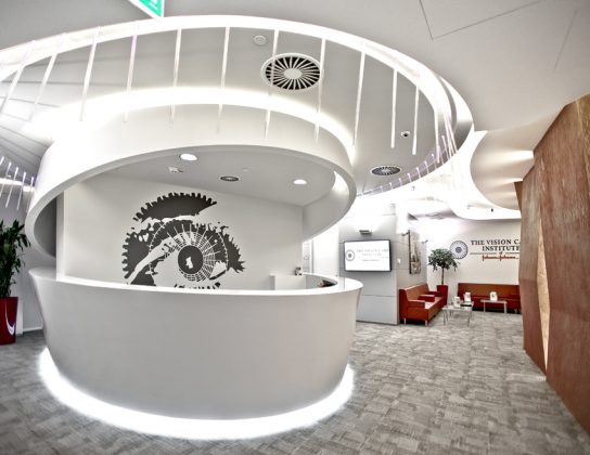
Sometimes the main idea of a project makes sense literally. For example, the logical and compositional center of the office of the international brand Johnson & Johnson Vision Care for contact vision correction is the reception unit. It was decided to make it from the modern technological material corian with “cilia” of luminous acrylic glass. “Cilia” have the signs “+” and “-” in cross section, as well as contact lens diopters. Each of them has its own angle of inclination, and together they form a smooth line and resemble a real eyelid.
4. Unusual special effects
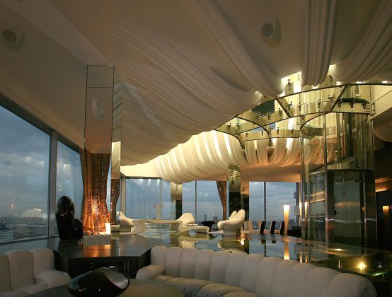
In a multi-level penthouse in the center of Moscow, it was required to create an element of the interior that would shake the imagination of the guests. They became an aquarium with fish in the living room podium.
This task is with complex technological calculations. It was necessary to decide how to design such a pool so that it looks good in the interior, is easy to maintain, does not leak, and the glass floor of triplex could withstand the load. For durability, glass columns are arranged inside the aquarium that are not visible in the water, and for spectacularity – internal lighting.
5. Lighting design
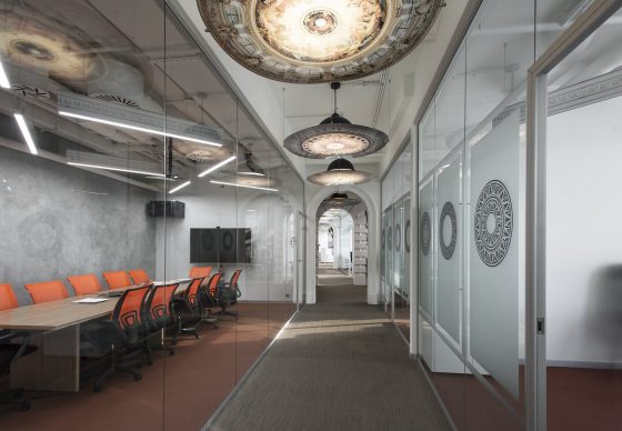
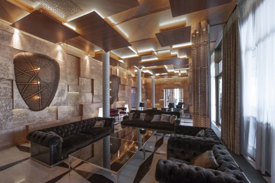
The interior of the guest house in Zhukovka is built on a fancy play of light and shadow. The rhythm, texture, light – three pillars of a good interior. Light is a plastic structure. She is able to charge space with energy. The hidden light sources used here are equal participants in a large-scale action. The light emitted through the carved surfaces creates whimsical ornaments on the ceiling, enhancing the play of various textures and volumes.
6. A single image
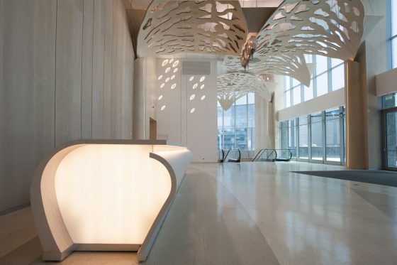
It is possible to combine zones of different functionalities with the help of one design concept. Thus, the design of business and residential halls for the Eurasia Tower in Moscow City turned out to be very soft and lyrical due to stylized tree crowns. Surrounded by hard cold urban forms, a living and pleasant in sensation and perception space arose.
7. Only copyright decisions
When there is a task to create a space not so much functional as entertaining, you can use the most extraordinary techniques. In this penthouse, the recreation area was separated from the private rooms by a large-scale glass partition. And this is perhaps one of the most amazing and expensive penthouse design solutions. The partition was conceived in the form of a curved wave of turquoise color. The living room furniture was made in the same color scheme.
Full interview: Salon Interior
